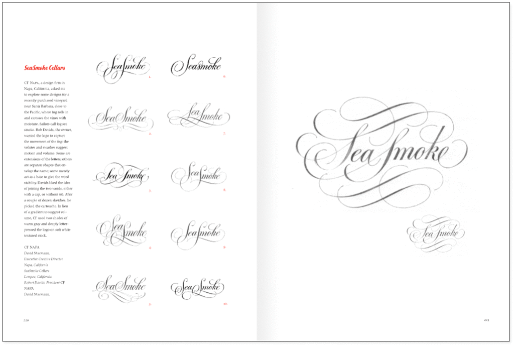
If there is time, I like to think about a new job a day or so before I put pencil to paper. But first, there is research to do. Sometimes the client supplies the competition’s logos, or, I sometimes have to do the research, a most important exercise for any logo design. I begin the design process in the same way that I first learned how to draw letters: with an HB pencil on tracing paper at a small size. I first fold a letter-size sheet of bond paper from top to bottom to use as an underlay for my hand so that the graphite doesn’t smudge.

Depending on how long the logo is, I usually make a rough sketch at about 1½ to 2 inches wide, sometimes smaller if it is a short word. Sometimes I draw the letters in skeleton form only to see how the word looks. Additional letterspacing will lengthen the word and often give it more importance. I also explore extended letters and try to make the word a distinctive shape. If there is a troublesome spacing combination, I try to minimize it by joining two letters with a ligature. I explore the standard possibilities: caps and lowercase; all caps; caps and small caps; italic.
If the name or product suggests elegance and quality, I might draw one or more letters with restrained swashes. If the name is made up of two or more words, one of these might change type style, or be either a lighter a bolder version than the other words, or the word could be smaller, or larger, and could be a different orientation, or italic or script. Explore the possibilities These are the basic approaches, and are not dependent on color or decorative styles, which may be explored once a general arrangement is arrived at.
When the logo is for a large corporation, I draw conservative shapes. Many of the world’s great corporations often have logos that appear to be plain and familiar fonts, but close observation often reveals subtle modifications. A logo may be dependent on only one small detail. Consider Microsoft. The logo might possibly require a border, or be contained in some distinctive shape. After a few roughs, when the word begins to take shape, I trace the letters with more detail and add stem thickness and serifs, or I weight up the skeleton letters and make a sans serif letter. I continue roughs in this manner until I am satisfied that I have some workable solutions, including roughs for client requests for a particular style or direction (though request a direction and then chose a different concept).
There are days when ideas are elusive, and then I go to type reference books for inspiration. Jaspert, Berry and Johnson’s The Encyclopaedia of Typefaces is a favorite because over 3,000 fonts are shown in the major categories: serifs, scripts, sans serifs, and decorative faces. I also have a “morgue” of examples that I have clipped from various sources over a long time.
From twenty or thirty small rough idea sketches, I select from three to ten designs to draw in a tighter fashion. If I am unhappy with my efforts, I do more sketches. The number of designs I submit varies and greatly depends on the client’s budget and schedule. Usually, I make laser copies of equal size for proper evaluation, and trace these, adjusting the weights, spacing, and proportions, and draw the letters more carefully. I then make a final, tight pencil tracing at this size on white vellum. Using a finely pointed 2h pencil, I draw barely perceptible horizontal guidelines. If the design is an italic or a script, diagonal guide lines are drawn too (a request that many students balk at). These are faint but still useful—yet I think enhance the sketch quality. Whether I use an HB, f, or 2h pencil greatly depends on the humidity. In California, where I work, the humidity varies from damp mornings to dry afternoons. When there is moisture in the paper a softer pencil is required to produce a dark, filled-in letter. Later in the day a 2H produces a density equal to the early morning HB.
The great trick, though, in producing a beautiful, tight comp is to keep the pencil constantly pointed, because vellum is toothy and quickly wears down the lead point; I use an electric draftsman’s lead pointer. A sand pad works equally well, though the graphite dust is messy. I like the standard size leads, not the .05 leads that maliciously break—but surely this is personal preference. The points can’t be sharpened, and are not pointed enough for my habits. As I draw, I rotate the pencil from time to time to find new points; this minimizes sharpening time. Depending on the letter style’s complexity, I spend from thirty minutes to one hour at most on each comp. I use short overlapping strokes and light pressure to get the shape just right. When satisfied, I darken the thick parts of a stem by filling in the paper’s loose fibers with graphite by repeatedly going over the letter without too much pressure (dark, shiny, buckled logos don’t give a true picture). I keep the thin portions and serifs as light gray pencil lines, and draw the serif tips first with a bit more pressure so that the ends are darker in the manner of a draftsman’s snapped dimension lines. Excess graphite dust from around the word or between the letters can be blown off, or lifted with a pliable, well-worked kneaded eraser. Fussy areas can be cleaned up by squeezing the eraser to create a thin edge. If a letter is too heavy, I place tracing paper over it, exposing only the amount to be removed, which can be done cleanly and expertly with the kneaded eraser, or a white or pink Pearl eraser. This works fine for straight stems, but larger portions of curves must be removed and then re-drawn.
When satisfied, I spray-fix each comp with three or four light coats and back it with 28-pound ledger paper so that the vellum appears opaque. This can be accomplished with a small amount of rubber cement along the top edge, or the vellum can be affixed with half-inch-wide white drafting tape. In the lower right-hand corner I draw a discrete 12-point Bodoni figure for easy reference.
Clients seem always impressed with a carefully drawn comp, more so than with a bloodless computer rendering. Often a client will select two or three versions for evaluation, and these are used to prepare a letterhead and business card design where color can be applied. To create these I make a 300-percent enlargement and trace it carefully on tracing paper to make adjustments in the shapes and spacing. Then I make another tracing (using guide lines too); this time I ink it with a fine felt-tipped pen. I rarely use retouch white; if the consistency is too wet it buckles the thin tracing paper, which distorts the image when it is scanned. Without too much trouble, some areas of the scanned image may be smoothed out, trimmed, or added to in Photoshop using the eraser, the pencil, or brush tool.
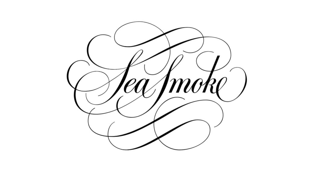
The tight ink-comp laser image is often shown to the client for final approval.
I prepare camera-ready art by importing the image into the template layer of a font drawing program. There are several popular ones, I use Fontographer and am comfortable with it. The character images can only be enlarge by 800 percent, which is sometimes not adequate to create small detail. I then enlarge the image to a size that permits me to finesse the detail, and then reduce the image to its normal size. There are three layers: one for drawing with Bézier points, a background layer where a scanned image or bitmap can be imported or pasted, and a layer for guides that are common to the total font. The Bézier points and arms are similar to Illustrator’s, yet there is an added feature. Fontographer offers three different kinds of points. A corner point which allows the arms to move independently, a curve point with arms that may be extended on either side of the point, and the bonus—a tangent point which is used as a transition between a straight line and a curved line. By shifting the point further away from the curve and extending its arm produces a larger radius between the two lines, and carefully manipulated will create a line without a visual corner. There are handy keyboard commands that permit easy transition from one letter to another. A great feature is the metrics window which allows the user to kern individual pairs easily.
I don’t use the outlining command, because it creates excessive points that must be removed. If “remove points” is done automatically, the shape becomes distorted, so I draw the outlines from scratch. When the word or image is excessively long, or if there is an abundance of points and it will not print, I divide the logo into two or more character cells. There are various rules to follow when using Bézier curves, but the most important to remember are: (1) use a minimum number of points so that the logo will print quickly; (2) when possible, make the Bézier point’s arms of equal length to avoid corners when possible; (3) don’t cross another arm’s path or place the points in close proximity except at corners; (4) keep the arms parallel to the curve; (5) examine laser printouts frequently and adjust the position of the points so that corners or interruptions of a curve’s flow are smoothed out; and (6) remember that there must be points placed on the outermost limits of curve, i.e., top, bottom, left, and right. These are called extrema points and are necessary to create the hints for small screen size. Be sure also, to read the manufacturer’s users manual.
The completed logo is a font and can be mixed easily with other fonts. Its great advantage is that it may be scaled from 4 points to large sizes for signage without any loss of detail.